Statistical Quality Control (SQC) is a method used to monitor and control the quality of a product or service by using statistical techniques and methods. It is a systematic approach to ensuring that the products manufactured meet the specified quality standards and requirements. SQC helps organizations to identify and control the sources of variability in the production process, which can lead to defects or nonconformance.
SQC involves collecting data, analyzing the data using statistical tools, and making decisions based on the results of the analysis. The data collected can come from a variety of sources, including production processes, inspection results, and customer feedback. The statistical techniques used in SQC can range from simple statistical measures, such as mean and standard deviation, to more complex statistical models, such as control charts and Design of Experiments (DOE).
The goal of SQC is to continuously improve the quality of products or services by reducing variability and improving processes. This can lead to increased customer satisfaction, lower costs due to reduced waste and rework, and improved competitiveness in the market.
Overall, SQC is a powerful tool for organizations that want to improve their quality and competitiveness by using data and statistical analysis to make informed decisions about their processes and products
control limits
Control limits, in the context of statistical quality control, are lines or boundaries that are plotted on a control chart to distinguish between normal and abnormal behavior of a process. The control limits are calculated from the data collected from the process and are used to determine if the process is in statistical control or not.
There are typically two types of control limits used in SQC: upper control limit (UCL) and lower control limit (LCL). The UCL is the upper boundary or limit beyond which any data point is considered to be an out-of-control point, indicating that the process has deviated from its normal behavior. The LCL is the lower boundary or limit below which any data point is considered to be an out-of-control point, indicating that the process has deviated from its normal behavior.
Control limits are important in SQC because they help to determine if a process is operating consistently and within the expected limits. If a data point falls outside of the control limits, it can be an indicator of a problem with the process and can trigger an investigation to identify and correct the root cause.
In summary, control limits provide a statistical framework for detecting and correcting variations in a process, and are essential for continuous improvement and maintaining quality control in an organization
specification limits
Specification limits, in the context of statistical quality control, are the predetermined bounds that define the acceptable range for a product characteristic or process output. The specification limits define the criteria for conformance or non-conformance of a product to the established standards or customer requirements.
For example, in the manufacturing of a component, the specification limits may specify the acceptable range of dimensions, weight, strength, or other characteristics of the finished product. If a product falls outside of the specification limits, it is considered to be non-conforming and may be rejected or reworked.
Specification limits are established based on customer requirements, industry standards, and the manufacturer’s own goals for quality and performance. They serve as the target for the process and are used as a basis for setting control limits in statistical quality control.
In summary, specification limits are an essential component of quality control in an organization, as they provide a clear definition of the acceptable quality criteria for products or services, and serve as a benchmark for continuous improvement and process control
tolerance limits
Tolerance limits, in the context of statistical quality control, are the acceptable bounds for deviation from the target or specification limits for a product characteristic or process output. Tolerance limits define the range within which a product or process can vary while still meeting the customer requirements and quality standards.
For example, in the manufacturing of a component, the tolerance limits may specify the acceptable range of dimensions, weight, strength, or other characteristics of the finished product, which may vary slightly from the target or specification limits. If a product falls within the tolerance limits, it is considered to be conforming, even if it is not exactly the same as the target or specification limits.
Tolerance limits are established based on the customer requirements, industry standards, and the manufacturer’s own goals for quality and performance. They serve as a flexible range for the process and help to account for normal variations in the production process.
In summary, tolerance limits are an important component of quality control in an organization, as they provide a level of flexibility for the production process and help to ensure that products or services meet the customer requirements and quality standards, even if they are not exactly the same as the target or specification limits
process and product control
Process and product control are two key concepts in statistical quality control (SQC) that are used to monitor and improve the quality of a product or service.
Process control refers to the techniques and methods used to monitor and control the production process to ensure that it is operating consistently and within the expected limits. The goal of process control is to detect and correct variations in the process, so that the process remains in statistical control and produces products or services that meet the established quality criteria.
Product control, on the other hand, refers to the techniques and methods used to monitor and control the quality of the finished product or service. The goal of product control is to detect and correct defects or nonconformities in the product, so that the product meets the established quality standards and customer requirements.
In SQC, both process control and product control are important for ensuring that the final product or service meets the required quality criteria. Process control helps to maintain consistency in the production process, while product control helps to detect and correct defects or nonconformities in the finished product
Control charts for X and R
What is it?
An X-bar and R (range) chart is a pair of control charts used with processes that have a subgroup size of two or more. The standard chart for variables data, X-bar and R charts help determine if a process is stable and predictable. The X-bar chart shows how the mean or average changes over time and the R chart shows how the range of the subgroups changes over time. It is also used to monitor the effects of process improvement theories. As the standard, the X-bar and R chart will work in place of the X-bar and s or median and R chart. To create an X-bar and R chart using software, download a copy of SQCpack.
What does it look like?
The X-bar chart, on top, shows the mean or average of each subgroup. It is used to analyze central location The range chart, on the bottom, shows how the data is spread . It is used to study system variability
When is it used?
You can use X-bar and R charts for any process with a subgroup size greater than one. Typically, it is used when the subgroup size falls between two and ten, and X-bar and s charts are used with subgroups of eleven or more.
Use X-bar and R charts when you can answer yes to these questions:
Do you need to assess system stability?
Is the data in variables form?
Is the data collected in subgroups larger than one but less than eleven?
Is the time order of subgroups preserved?
Getting the most
Collect as many subgroups as possible before calculating control limits. With smaller amounts of data, the X-bar and R chart may not represent variability of the entire system. The more subgroups you use in control limit calculations, the more reliable the analysis. Typically, twenty to twenty-five subgroups will be used in control limit calculations.
X-bar and R charts have several applications. When you begin improving a system, use them to assess the system’s stability .
After the stability has been assessed, determine if you need to stratify the data. You may find entirely different results between shifts, among workers, among different machines, among lots of materials, etc. To see if variability on the X-bar and R chart is caused by these factors, collect and enter data in a way that lets you stratify by time, location, symptom, operator, and lots.
You can also use X-bar and R charts to analyze the results of process improvements. Here you would consider how the process is running and compare it to how it ran in the past. Do process changes produce the desired improvement?
Finally, use X-bar and R charts for standardization. This means you should continue collecting and analyzing data throughout the process operation. If you made changes to the system and stopped collecting data, you would have only perception and opinion to tell you whether the changes actually improved the system. Without a control chart, there is no way to know if the process has changed or to identify sources of process variability.
Control charts for number of defective {n-p chart}
NP CONTROL CHARTS
An np control chart is used to look at variation in yes/no type attributes data. There are only two possible outcomes: either the item is defective or it is not defective. The np control chart is used to determine if the number of defective items in a group of items is consistent over time. The subgroup size (the number of item in the group) must be the same for each sample.
A product or service is defective if it fails, in some respect, to conform to specifications or a standard. For example, customers like invoices to be correct. If you charge them too much, you will definitely hear about it and it will take longer to get paid. If you charge them too little, you may never hear about it. As an organization, it is important that your invoices be correct. Suppose you have decided that an invoice is defective if it has the wrong item or wrong price on it. You could then take a random sample of invoices (e.g., 100 per week) and check each invoice to see if it is defective. You could then use an np control chart to monitor the process.
You use an np control chart when you have yes/no type data. This type of chart involves counts. You are counting items. To use an np control chart, the counts must also satisfy the following two conditions:
You are counting n items. A count is the number of items in those n items that fail to conform to specification.
Suppose p is the probability that an item will fail to conform to the specification. The value of p must be the same for each of the n items in a single sample.
If these two conditions are met, the binomial distribution can be used to estimate the distribution of the counts and the np control chart can be used. The control limits equations for the np control chart are based on the assumption that you have a binomial distribution. Be careful here because condition 2 does not always hold. For example, some people use the p control chart to monitor on-time delivery on a monthly basis. A p control chart is the same as the np control chart, but the subgroup size does not have to be constant. You can’t use the p control chart unless the probability of each shipment during the month being on time is the same for all the shipments. Big customers often get priority on their orders, so the probability of their orders being on time is different from that of other customers and you can’t use the p control chart. If the conditions are not met, consider using an individuals control chart.
NP CONTROL CHART EXAMPLE: RED BEADS
The red bead experiment described in last month’s newsletter is an example of yes/no data that can be tracked using an np control chart. In this experiment, each worker is given a sampling device that can sample 50 beads from a bowl containing white and red beads. The objective is to get all white beads. In this case, a bead is “in-spec” if it is white. It is “out of spec” if it is red. So, we have yes/no data – only two possible outcomes. In addition, the subgroup size is the same each time, so we can use an np control chart.
Data from one red bead experiment are shown below.The numbers represent the number of red beads each person received in each sample of 50 beads.
Worker
Day 1
Day 2
Day 3
Day 4
Tom
12
8
6
9
David
5
8
6
13
Paul
12
9
8
9
Sally
9
12
10
6
Fred
10
10
11
10
Sue
10
16
9
11
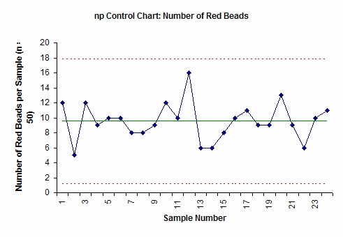
The np control chart from this data is shown below.
The np control chart plots the number of defects (red beads) in each subgroup (sample number) of 50. The center line is the average. The upper dotted line is the upper control. The lower dotted line is the lower control limit. As long as all the points are inside the control limits and there are no patterns to the points, the process is in statistical control. We know what it will produce in the future. While we don’t know the exact number of red beads a person will draw the next time, we know it will be between about 2 and 17 (the control limits) and average about 10.
STEPS IN CONSTRUCTING AN NP CONTROL CHART
The steps in constructing the np chart are given below. The data from above is used to demonstrate the calculations.
1. Gather the data.
a. Select the subgroup size (n). Attributes data often require large subgroup sizes (50 – 200). The subgroup size should be large enough to have several defective items. The subgroup size must be constant.
In the red bead example, the subgroup size is 50.
b. Select the frequency with which the data will be collected. Data should be collected in the order in which it is generated.
c. Select the number of subgroups (k) to be collected before control limits are calculated. You can start a control chart with as few as five to six points but you should recalculate the average and control limits until you have about 20 subgroups.
d. Inspect each item in the subgroup and record the item as either defective or non-defective. If an item has several defects, it is still counted as one defective item.
e. Determine np for each subgroup.
np = number of defective items found
f. Record the data.
2. Plot the data
a. Select the scales for the control chart.
b. Plot the values of np for each subgroup on the control chart.
c. Connect consecutive points with straight lines.
3. Calculate the process average and control limits.
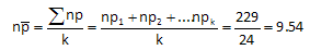
a. Calculate the process average number defective:
where np1, np2, etc. are the number of defective items in subgroups 1, 2, etc. and k is the number of subgroups.
In the red bead example, each of the six workers had 4 samples. So, k = 24. The total number of red beads (summing all the data in the table above) is 229. Thus, the average number of defective items (red beads) in each sample is 9.54.
b. Draw the process average number defective on the control chart as a solid line and label.
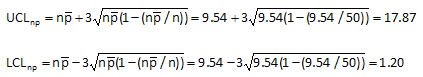
c. Calculate the control limits for the np chart. The upper control limit is given by UCLnp. The lower control limit is given by LCLnp.
The control limits for the red bead data are calculated by substituting the value of 9.54 for the average number defective and the value of 50 for the subgroup size in the equations above. This gives an upper control limit of 17.87 and a lower control limit of 1.20.
d. Draw the control limits on the control chart as dashed lines and label.
4. Interpret the chart for statistical control.
a. The following tests for statistical control are valid.
Points beyond the control limits
Length of runs test
Number of runs test
The red bead control chart (shown above) is in statistical control. All the points are between the control limits and there are no patterns. Remember that the upper control limit represents the largest number we would expect if only common cause of variation is present. The lower control limit represents the smallest number we would expect. As long as the process stays the same, we can predict what will happen in the future. Each person will have between 2 and 17 red beads in the sample. This won’t change until we fundamentally change the process.
c-chart
What is it?
A c-chart is an attributes control chart used with data collected in subgroups that are the same size. C-charts show how the process, measured by the number of nonconformities per item or group of items, changes over time. Nonconformities are defects or occurrences found in the sampled subgroup. They can be described as any characteristic that is present but should not be, or any characteristic that is not present but should be. For example a scratch, dent, bubble, blemish, missing button, and a tear would all be nonconformities. C-charts are used to determine if the process is stable and predictable, as well as to monitor the effects of process improvement theories. C-charts can be created using software products like SQCpack.
What does it look like?
The c-chart shows the number of nonconformities in subgroups of equal size.
 . It is used to study system variability